Jessica Poundstone on Freakonomics Radio Show "Economics of Everyday Life"!

I'm on the Freakonomics podcast "The Economics of Everyday Things" talking about Hotel Art! Hosted by Zachary Crockett, produced by Morgan Levey and with fellow guest Gavi Wolf founder of Indiewalls who I’ve worked with frequently (and love) and who recommended me! Thanks to everyone involved - it was so fun! Read the transcript below, listen to the 15-minute episode by clicking above, or here on the Freakonomics website — or wherever you get your podcasts!

TRANSCRIPT: “The Economics of Hotel Art” - Episode 76 of the Freakonomics Radio Show, “The Economics of Everyday Life”

Jessica Poundstone remembers the message that changed her life.

POUNDSTONE: It was a note through Instagram from an art advisory firm saying, “Hey, we love your work. We’d love to discuss using it in a hotel project that we’re working on. Get in touch.” 

Poundstone makes her living as a visual artist, but at the time she was working as a creative director for a software company. The message was intriguing, so she did a little research.

POUNDSTONE: I was not familiar with the concept of art advisory firms at the time. And so I looked them up, quickly kind of understood their business model, and was like, “Wow, this is very cool.” 

Today Poundstone works with a dozen art advisory firms. They help her sell her work to commercial spaces across the world — cruise ships, casinos, restaurants. And… hotels.

POUNDSTONE: Art in a hotel is everywhere when you really think about it. You go to the elevator, there’s a piece of art either behind you or next to you. Sometimes in the elevator itself there will be artwork that’s in the form of wallpaper or maybe a painted mural. When you get to your floor, there’s artwork on a little table or at the end of the hallway. And then you go into your room and there’s more artwork. Having stayed in many hotels and looked at a lot of hotel art felt like, my artwork would be nice to have in a room that someone was staying in. Instead of something that was just, I don’t know, boring, or worse, just terrible. 

When you think of hotel art, you might imagine a generic photograph of a city skyline, or a bad take on an abstract painting. The stuff on the walls at most big hotel chains is bland and forgettable at best, and laughable at worst. But in recent years, hotels have been attempting to reverse this stigma.

WOLF: They really have to up their game in order to get people to come back to the properties. So, they’d rather have nothing at all than having something that makes people say, “That’s hotel art.”

For the Freakonomics Radio Network, this is The Economics of Everyday Things. I’m Zachary Crockett. Today: Hotel art.

*      *      *

A hotel can have hundreds, or even thousands, of individual pieces of artwork. And even though some of this art can sometimes seem like an afterthought, there are dedicated teams of people who spend a lot of time picking it out.

KETTRING: I like to refer to artwork as the jewelry of the space.

That’s Melanie Kettring, she’s the director of studio design at Best Western hotels.

KETTRING: We select all of the finishes and the furniture, and they’re all very important and critical to the space. But really, what helps a person feel the excitement or whatever mood we’re trying to inspire, it really is brought out through the artwork. Our go-to is 2 per guestroom, 3 in suites. Lobbies and public areas is really just driven on where it needs it.

Best Western hotels follow a membership model. This means that instead of each property using the same design prototype, each franchise owner is free to make their own interior design choices. Kettring’s team helps owners develop their taste. And she’s the first to admit that, historically, “taste” has been kind of a generous word.

KETTRING: For years it would have been stock photography or stock art — something that you’d see printed a million times. I’m thinking of a photo right now where you have the three rocks that are stacked. We’ve probably all seen that.

CROCKETT: The cairn. 

KETTRING: Yes, cairn we’ve seen over and over again.

But Kettring says Best Western is one of many hotel chains that is trying to be more intentional about its artwork.

KETTRING: We’re trying to capture the local. That’s a lot of times what’s driving the choices in artwork. Perhaps it is black and white photography that then has colored overlays so it’s not just straight photography. Sometimes it is going to be more contemporary and have a different type of flair. 

Finding artwork in local markets all over the country is a lot of work. And when Kettring needs help, she often calls in a consultant. Someone like Gavi Wolf.

WOLF: We help all different types of commercial properties to source artwork to tell the story of the property. So we do that for everybody from a hotel like a Hilton hotel to a corporate office, like a Sirius XM, or a Spotify, or an Amazon.

Wolf is the founder and C.E.O. of Indiewalls, an art advisory firm. He started the company 13 years ago as a side project. The original idea was to help cafés and restaurants sell the artwork on their walls.

WOLF: People do not buy artwork out of restaurants and cafés very often, so that is not a good idea — don’t do that, Zack. 

The business pivoted many times. But it found a more promising direction when a hotel came to them with a proposal

WOLF: We had a property, actually the Andaz on Fifth Avenue in New York City, and they said, “We want to buy artwork for the suites of our hotel.” They had about $30,000 for the suites, for the artwork, and we said, “For $30,000 we’ll do kind of whatever you need us to do.” And we figured it out for them. And then realized there was this whole industry of artwork for commercial spaces and commercial buyers and what that really looked like.

For bigger projects, clients often bring Wolf in before the building is even constructed.

WOLF: So we’re getting in touch with them three years before the hotel’s even going to open and they’re like, “These are the concepts. There’s nothing there. You’ll just see a hole in the ground, but here’s what we need to start working on,” and we need to do everything soup-to-nuts. The first person to reach out to us is the designer. So this owner of this hotel has hired a design firm to design the whole hotel. And that design firm is reaching out to us and saying, “Here’s the narrative we’re trying to create for this property.” Here’s the history of the property. We’re then starting to propose artwork that we believe fits their storyline, so we go back and forth with them a bunch. And then at some point the owner is going to say, “Yes, I love this work. It fits in my budget. It tells the story the way the designer likes it.” Now we have to get signoff from the brand. We’re trying to get it to that point where the budget, the design, the story, the brand guidelines all match up to then get them to a place where they’re ready to order the pieces. Then they order from us and we do the fulfillment of the whole thing. 

Wolf says that there are a few general rules for selecting hotel art that apply to most clients.

WOLF: Artwork with a lot of words in it and text is often not going to be a fit for commercial properties, because they don’t want to be too specific in telling people a message. Literal faces of people — also not a big thing. Usually in a hotel you’re trying to work to combine the aesthetic of the artist and their abilities with the design and aesthetic of the hotel. 

No matter what art gets chosen, it typically gets ordered in very large volumes. Melanie Kettring says that, at Best Western, a franchise owner often reuses the same art throughout the building.

KETTRING: Occasionally they would like to do something different if they’ve got a honeymoon suite. But the most economical is to just do the same in all rooms. 

CROCKETT: And how many rooms does a Best Western have on average

KETTRING: Average is about 80 to 100 rooms. 

CROCKETT: Okay. So if you find a piece of art that fits the owner’s aesthetic they’re looking for, the price is right, you might be ordering, you know, something like 80 prints of that particular piece of art for one hotel?

KETTRING: Yes. You can also use the same piece of artwork on each floor. So you may have seven pieces running down a corridor and those can be duplicated on floors two and three. A rule is that you would not duplicate a piece on the same floor.

Ordering all of this art is very expensive. And it’s the hotel owner’s responsibility to foot the bill. At Best Western, the average spend is around $500 per room. That usually works out to something like $15 to $50,000 per hotel. Wolf says this is actually closer to the lower end of what he’s seen in the business.

WOLF: At the higher end brands, you could be spending between $500,000 to $1 million on the artwork for your whole hotel. Kind of mid-range, some of what we see as standard for the types of projects we often work on, it’s in the $150,000 to $250,000 range for the artwork in the hotel. And then it can go down — you know, when you’re working on brands like a Candlewood Suites, which are really select service, they’ll spend anywhere from $15,000 to $25,000.

Consultants like Wolf are generally paid a percentage of a hotel’s artwork budget. But landing a big hotel job is also a nice payday for the artists. That’s coming up.

*      *      *

When Jessica Poundstone first started making art, her process was pretty rudimentary.

POUNDSTONE: I was living in a very, very small apartment with my husband and two small children, and there was really no room for me to have studio space anywhere. And so me on the couch with my phone was a very manageable footprint. 

She used a program called Brushes to make abstract images.

POUNDSTONE: It was around the time that David Hockney was making work on an iPad and exhibiting it in very fancy museums. And I thought, “Well, if David Hockney is going to do this, why should I pooh-pooh it?” And it was one day on the bus, on my way to my day job that I hit upon a structure, a style that felt like exactly what I wanted to say. 

Poundstone knew that if she wanted to make art her full-time job, she needed to minimize risk and find multiple revenue streams. She now makes her living in several ways.

POUNDSTONE: I would say it’s around 30 percent from art advisory firms. Another 30 percent from licensing and 30 percent direct sales. Ten percent miscellaneous — this and that. 

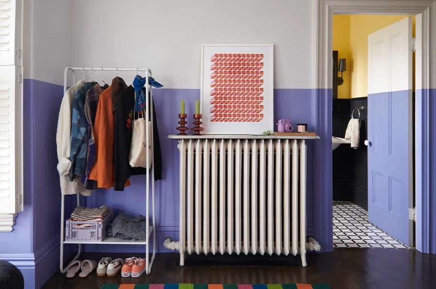
Her work is geometric, with bright bold colors and purposeful structure. It lends itself well to a hotel setting since it has no faces and no text. Working digitally also makes pricing for a commercial setting relatively easy.

POUNDSTONE: The usage, the size, and the volume are the three major factors. If it’s a one-time printing of something, for example, a hotel lobby, the price will be different than it would be per piece. For, let’s just say a 20-by-20 piece of art that’s going to go into every room in a hotel, depending on the number of stars the hotel has, or if it’s a boutique hotel or maybe a lower end hotel. But somewhere between $7 and $20 per piece — that’s generally the range that I’ve worked with. 

At this point in her career, Poundstone has a lot of experience with commercial projects, but she still goes through consulting firms, including Gavi Wolf’s company, Indiewalls. When a hotel is interested in one of Poundstone’s pieces, Wolf works out all the financials — the cost to make the piece of art, print it, and frame it — and then he pays a licensing fee directly to Poundstone.

WOLF: For volume pricing, it could range from, at the very low end, when the volume is very high, you know, a few dollars apiece — $10 to $20 to $30 a piece licensing is maybe a little more standard for kind of an average quantity, average sizing.

When you scale that up to a few hundred prints for a hotel, these licensing deals can be a pretty good gig for an artist.

WOLF: Even if it’s just, you know, $3 a piece and you have 100 pieces in each hotel, $300. And if they’re doing 200 of those hotels a year, that would be $60,000 a year and they wouldn’t have to do anything, they’d just get, like, a licensing fee.

There are several practical reasons an artist typically has to go through an art consultancy, rather than work out a deal with the hotel directly.

WOLF: There’s several different barriers they would hit in doing that. They’d want a volume pricing deal. The artist might not even know what to do for volume pricing. In terms of the framing, you also have to be able to do volume framing. And even the way that the frame is installed on the wall is done specifically to commercial grade. It has something called security hardware on the back. So if you’re in a hotel and you’re trying to take a piece of artwork off the wall, it should not come off the wall. 

CROCKETT: Is that just a safety issue — like, a painting needs to be bolted to the wall or something?

WOLF: It’s actually not a safety thing. You would just be surprised at how many people steal things out of hotels. We did artwork for a hotel and we did it into a brick wall. Somebody actually ripped the piece off of the wall and took out parts of the brick with the piece. So just like, stole it that way.

CROCKETT: That is a very low stakes art heist.

WOLF: Very. Right. They are not going to sell that piece anywhere. Maybe the hotel bought it for a couple thousand dollars, but they’re not going to be able to resell it for anything.

Poundstone appreciates not having to think about things like theft-proof wall mounting.

POUNDSTONE: Generally a project manager at an art consulting firm will get in touch and say, “Hey, we’d like to present your work to our client for their consideration. We’re thinking of these five pieces.” They’ll come back to me and say, “Great. The client loved your work. They want to move forward. We’ll send you their color palette.” They’ll give a timeline. Often these timelines for projects, by the way, are very, very long. Like maybe a year, maybe more. 

The designer might ask Poundstone to change the colors in her work to fit with the rest of the interior.

POUNDSTONE: If it’s a piece that’s just one color, it might be changing it from a blue to a different color of blue, or from a blue to a rust. I’m happy kind of having this creative director mindset about it. The advisory firm and the hotel are the clients, and we can make something that works within the structure of what I have created. 

This is the kind of mentality Wolf generally looks for when sourcing artists for his creative arsenal.

WOLF: One of the things with artists is there’s just their literal work, but there’s also working with them as just a partner. How flexible are they? How fast are they with responding? Artists often don’t think of themselves as businesses, but they are, and they need to sell it.

But even the most flexible artist will sometimes hold her ground.

POUNDSTONE: My work is pretty bright. It’s a lot of saturated colors. And so a couple of times projects have come up where they’re like, “They’re wondering if you could like tone all these colors down and make it more neutral.” And I’ll just kind of be like, “You know what? I think you’re probably looking for just a different artist.” I’m not going to like it. I don’t want to do it.

*      *      *

For The Economics of Everyday Things, I’m Zachary Crockett. This episode was produced by Morgan Levey and Sarah Lilley, and mixed by Jeremy Johnston. We had help from Daniel Moritz-Rabson. And thanks to listener Steve Reisman, who suggested this topic. If you have an idea for an episode, feel free to email us at everydaythings@freakonomics.com. Our inbox is always open. All right, until next week.

CROCKETT: Believe it or not, there probably are people out there who don’t really notice all of this artwork. 

WOLF: Oh, I believe it.

Jessica Poundstone + Otto Studio: Wallpaper, Murals & Tiles, Oh My!

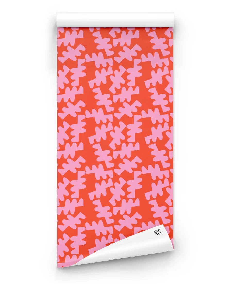
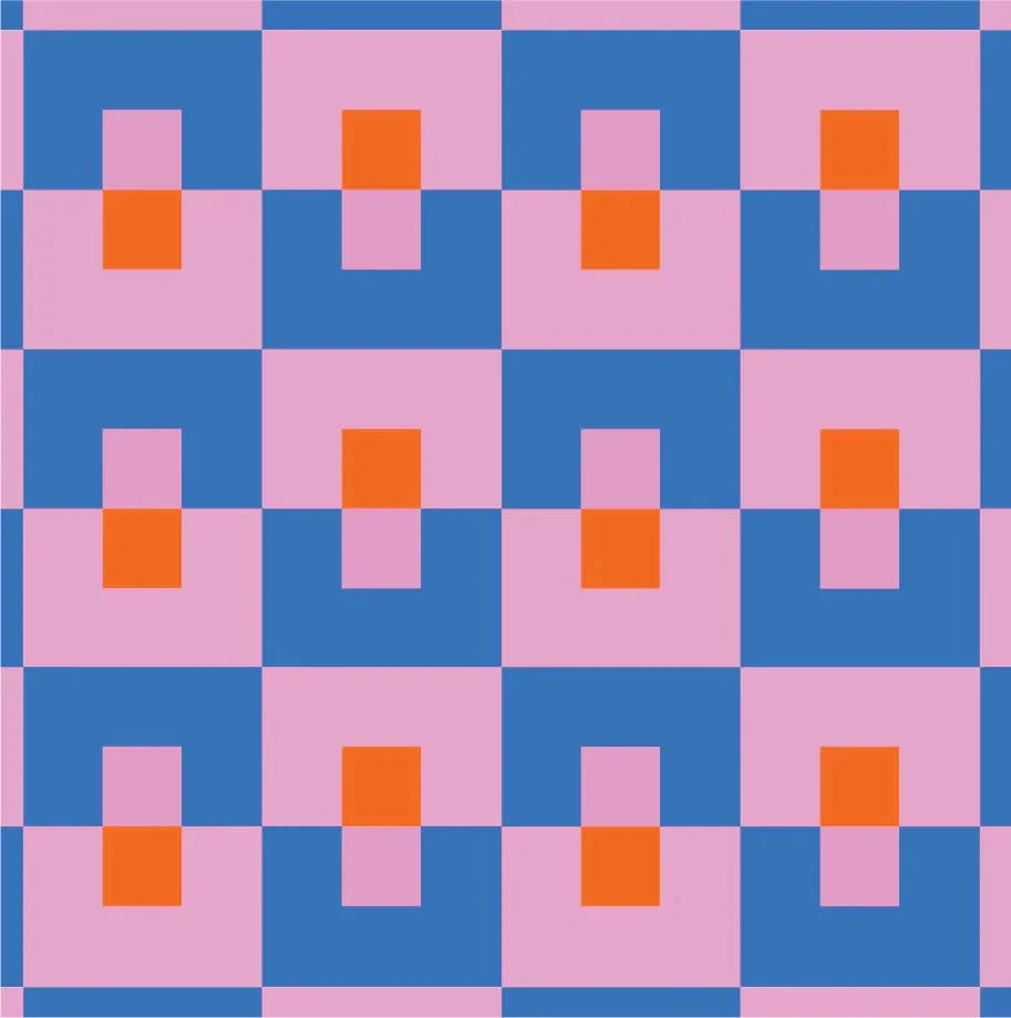
I’m so thrilled to share something I’ve wanted to do for so long: bring a peel-and-stick wallpaper/mural/floor tile collection to the world! I worked with the amazing founders of Vancouver B.C.-based Otto Studio to bring it all to life. See the collection here, and keep scrolling for my interview with Otto Studio including my musings about color, emotion, and staying up way too late! :)

Interview With Otto Studio: Jessica Poundstone On Color and Emotion

Jessica Poundstone is an artist and designer based in Portland, Oregon, USA. The core of her practice is her belief that art can change the way we see, think and feel. Informed and inspired by color sensation, minimalism and “light and space” art movements, her work explores the way color affects us emotionally, combining color, structure and softness to create a space for contemplation, comfort and connection.

How and when did your brand and creative journey come to life?

I’ve always been an artsy kid, so I guess my creative journey has and will remain lifelong 🙂 I’d say the moment this phase of the journey came to life was, after regularly posting work to Instagram, I got a DM asking if prints were available. It really lit me up that someone out there liked the work enough to want to live with it. I haven’t looked back since!

Tell us about your biz.

My biz tagline is “Let’s think and feel in color!” I do that through offering prints to collectors, as well as working with interior designers, set decorators, art directors, publishers, and companies like Otto Studio to bring good vibes anywhere and everywhere 🙂

Tell us about some highlights in your career.

Most recently, a set decorator reached out to me to ask if I’d be willing to have my artwork included in The new “Mean Girls” musical movie! Of course I said yes, and going to the theater and seeing it in the movie was truly, truly bonkers. I also found a behind-the-scenes picture of the set where Tina Fey (one of my personal heroes) is standing right next to my artwork. Does it even get better than that???

What inspires you on a day-to-day basis?

I have always been an image-collector, and get so inspired looking at images of interiors, beautifully designed objects, and work from other artists. I am surrounded by books, and like to leave them open to random pages so they can be living breathing inspirations, instead of just hanging out on shelves. I have a bunch of electronic image files and screenshots that I’ll look at, and of course Instagram is a treasure trove of amazingness. (And hilarious dog videos, which make my life immeasurably better, hahaha.)

Tell us a bit about your capsule collection with Otto Studio. Why did you choose the patterns? What was your inspiration behind these patterns?

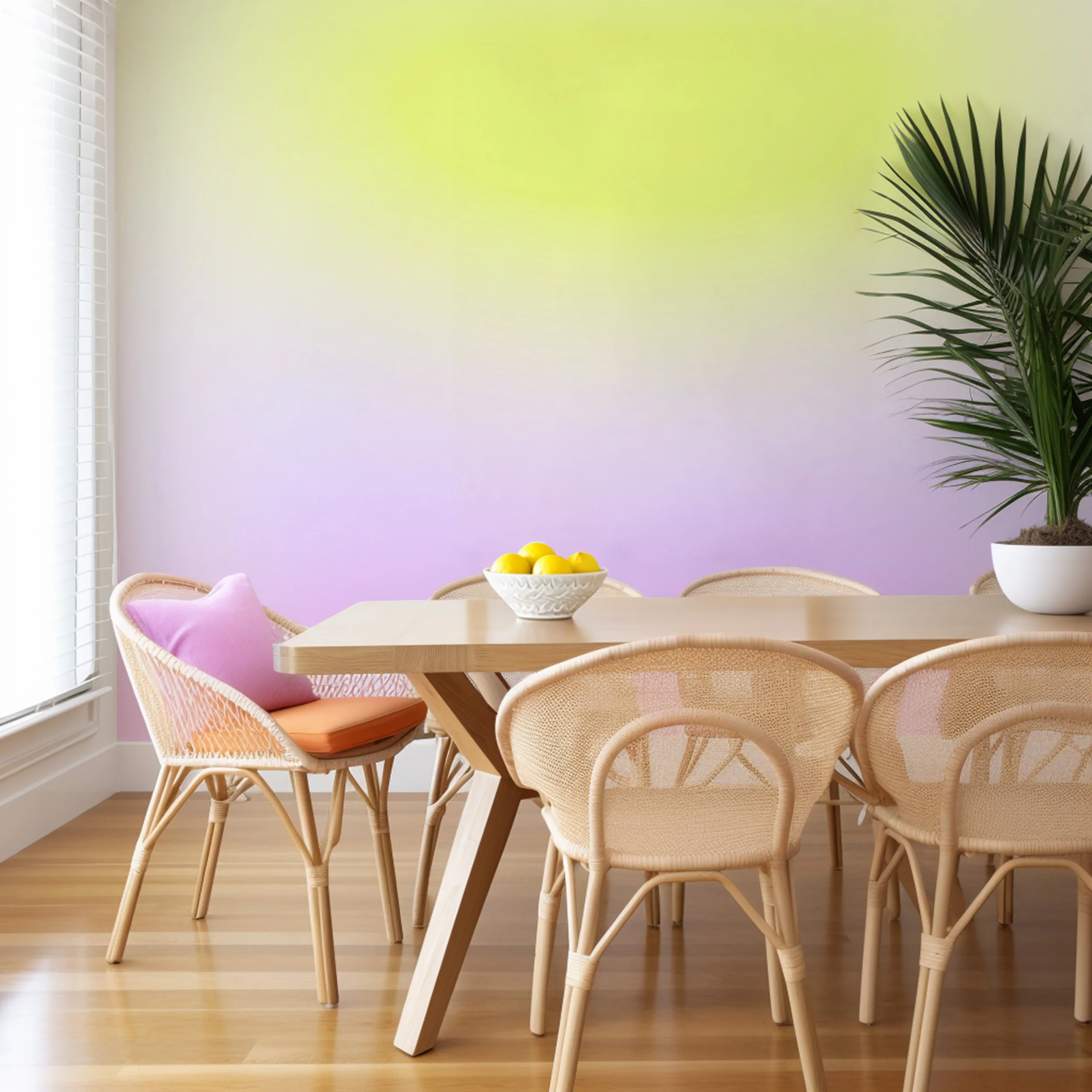
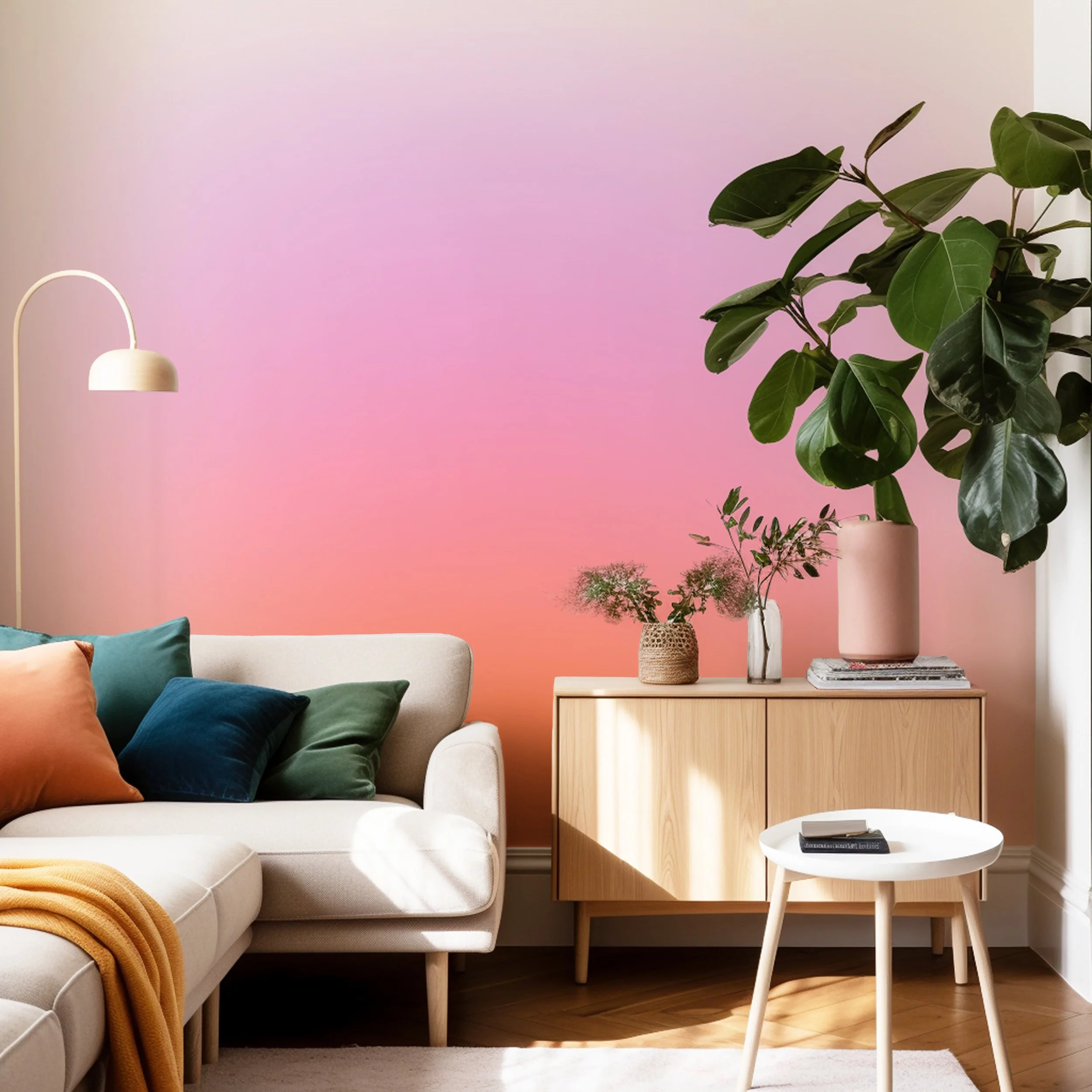
The collection has two distinct groups. The first grouping is wall murals, which are based on my Color Cloud and Hyperspectral Sensing collections. I love the idea of folks being able to experience that work in a large-scale, immersive way,

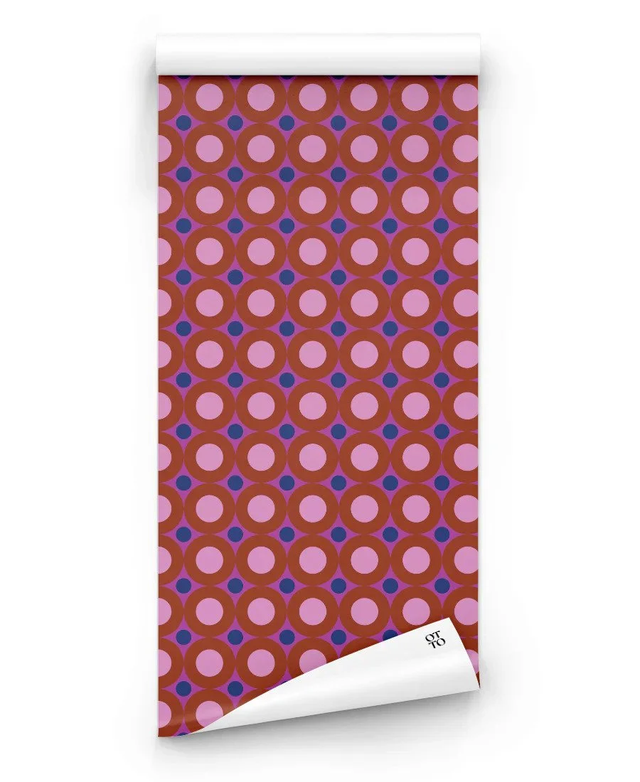
The second grouping is five repeat pattern designs, each of which have three colorways.These are truly just me having so much fun playing with colors and shapes that I love! It’s a pretty eclectic mix with a leaning toward geometric figures. One thread running through is that at least one colorway in each design includes the color pink. I cannot escape my love for pink! I definitely consider it to be a neutral 🙂

What would your advice be to your younger self, knowing what you know now about your career and journey? And to anyone else who is starting out as a creative?

I probably would have embarked on a creative career sooner in my life if I hadn’t been so worried about money! What I wish I would have known is that there are so many ways for creative folks today to support ourselves — teaching, direct sales, licensing, coaching, publishing to name just a few. Do not let skeptical folks convince you otherwise! Also, if you want to make a living with your creative skills, you don’t have to dive right in to trying to make it your full time gig. You can have a part time job — or several! Or you can do what I did for many years, which is to fit a creative practice into the hours of 11pm-2am. Just keep practicing the practice, and keep checking in with yourself about what feels right and good for you — and let that evolve over time to meet your evolving goals and needs.

Color Cloud Mural: “You’re Not Alone In This”

Which people or books have had the most influence on your creative growth/inspiration and why?

The French filmmaker Agnes Varda is a hero of mine: she has always been willing to bring her whole, quirky, brilliant, curious self to all of her projects. She has made documentaries, dramas, and even a few hilarious commercials all with her own flair, trusting her own vision and her own ideas. I also love the book “Wishcraft”, which I found via another book, “The Teenage Liberation Handbook”. Both books are basically conveying this message: your life is yours, don’t let other people or restrictive educational or social constructs dictate how to live it. I love that. Making your own way can be tricky, but it’s so worth it!

Talk about one of the biggest failures you’ve had. What did you learn from it?

My view on “failure” comes from a quote by the legendary actor and director André Gregory: “Everything leads to something.” I have experienced that truth so many times, I don’t even know what to categorize as a failure anymore! I will say that I’ve had many rejections — from artist residencies and art exhibitions and collaborations I’ve applied to or pitched. But in the process of doing the work required to pursue each of those opportunities, I had to get very clear about what I wanted and why I wanted it. And that information is priceless, because knowing what you actually want (not just what other people want for you, or what you think you should want) is just about the most important piece of information you can have to grow in the directions you want to go.

What does a typical day in your week look like?

It’s pretty fascinating, coming from literally decades of working in corporate America (writing, content development, creative director, etc.) how radically different my days are now than they were then. I’ve been self-employed as an artist since 2021, and it took me about a year to detox from the bad patterns I’d gotten into, which was essentially letting myself be driven by anxiety.

As it turns out, anxiety is not necessary for getting things done, or for doing them well. Now, a typical weekday involves very little if any stress, which I could not possibly have imagined as being possible for so many years!

I love staying up really late, which means I don’t love getting up early 🙂 I’m typically up by 9 or 10. First order of business is breakfast (almost always plain yogurt, frozen blueberries and granola) and coffee (pourover, dark, a splash of cream, thank you very much, haha) while scanning email and Instagram to see what I might need to respond to quickly. Depending on how I’m feeling that day, I might take my dog Stanley (he’s a Pug Chihuahua mix, aka a Chug!) for a walk, or get right to work.

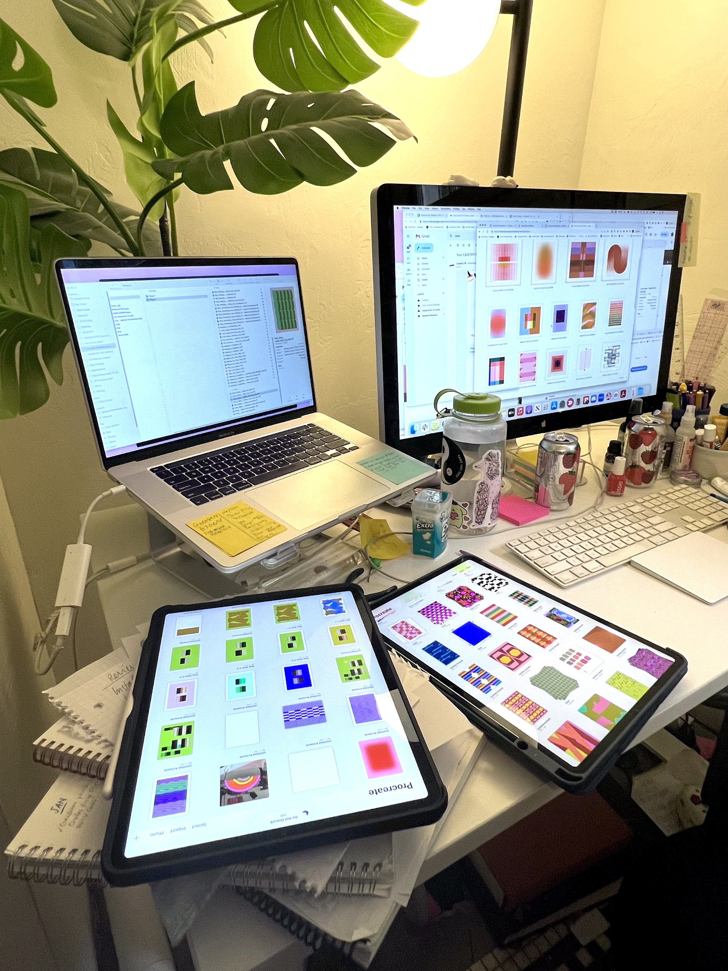
If I have design work to do, I might work on my iPad in our living room. If my priority is email responses or anything related to writing, I head down to my basement studio to work on a bigger screen and turn on music (Cuban, French or African – any music with singing that’s not in English – I get too distracted!) or white noise (current mix which I made myself is Brown Noise/Cars/Chimes/Crickets/Extreme Rain) to power through.

Lunch (one-half of Trader Joe’s Southwest Salad mix with some protein and rice cakes dipped in Chipotle Bitchin’ sauce) comes next, usually at around 1pm. I’ll read a book or watch a show during my lunch break so it really feels like a break.

After that, it’s either back to work or naptime! (Naps with Stanley are absolutely irresistible to me, they are one of my favorite things ever.) And then the afternoon might be spent finishing more work, exploring new ideas in paint or on the internet or in writing, walking Stan, getting in some exercise (Beat Saber on VR! Underdesk bike! Dance workout with Emily Thorne aka emkfit via YouTube! I am trying!) or or just chilling out and reading.

On the nights when everybody (my husband Ben and our two kids Henry, a high school freshman, and Sophie a high school senior) is home, we’ll all have dinner together and chat about our day (aka the kids using words Ben and I don’t understand and then laughing at us because we are old, hahaha). We have a really good time together as a family, which is such a gift.

After dinner, Ben and I will watch something together (Taskmaster, Silent Witness, After Midnight, Inspector Montelbano…who knows!) and then he goes to bed around 10:30. I usually then go back to work on my laptop, or head down to the studio to paint. The hours between 11pm-2am are magical for me in terms of getting into a creative zone. I think it might come from so many years of fitting my art practice into my schedule: that was the time I had available. But even though I have my pick of time slots now, these are still the hours I love the best.

I then (usually begrudgingly but gratefully) head to bed so I can start it all over again the next day 🙂

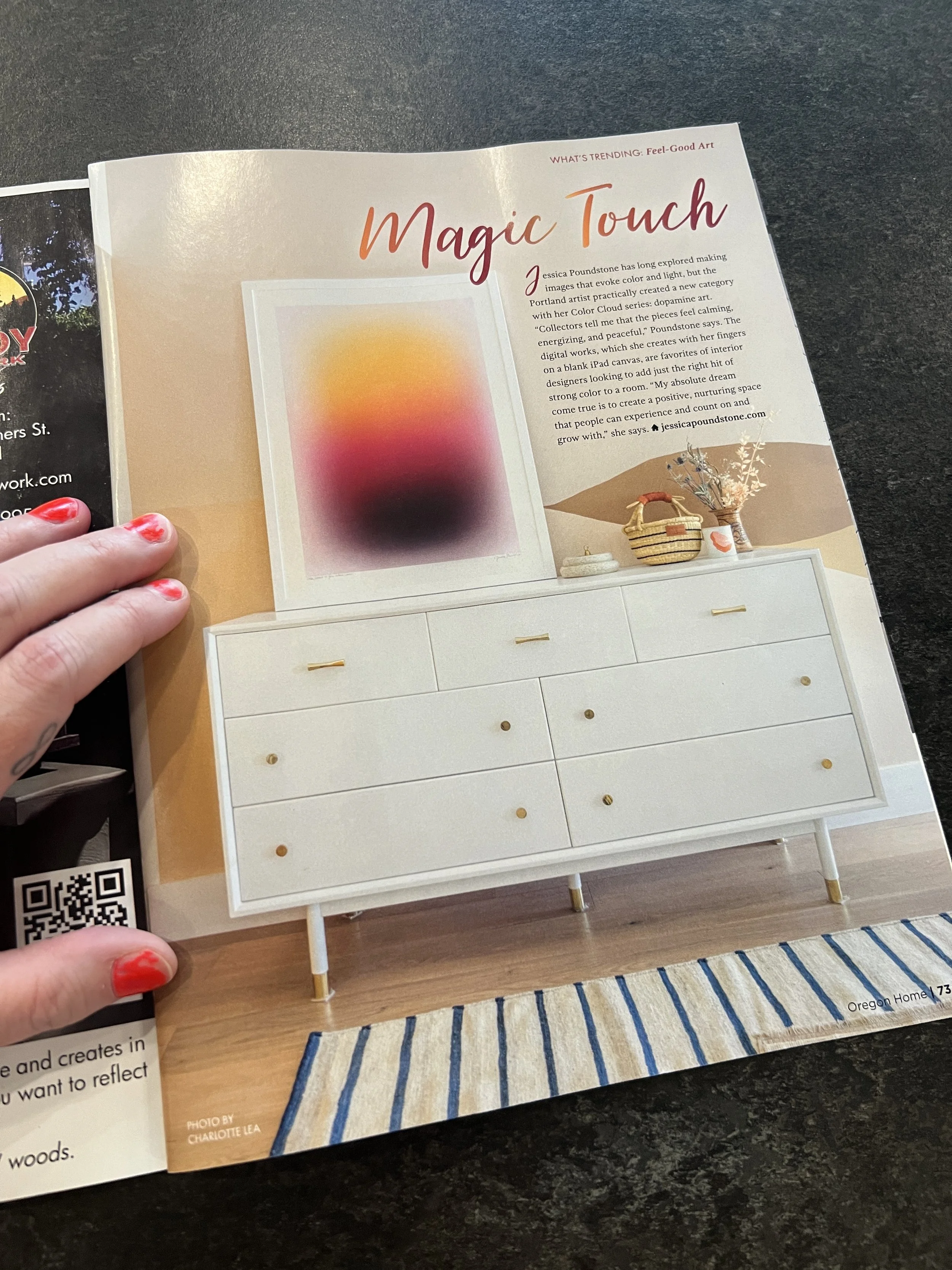
Oregon Home Magazine Features "Color Cloud: You Never Know"

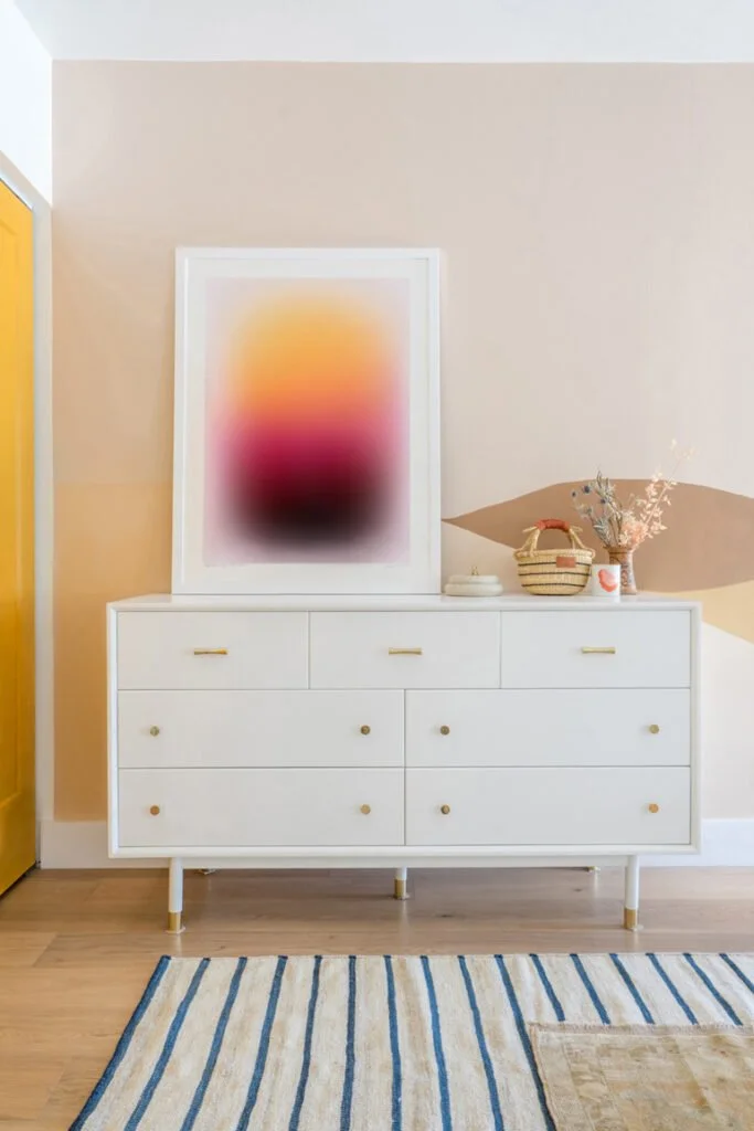
Emily Grosvenor, editor at Oregon Home Magazine made this month’s issue all about color, and I was lucky enough to get a shoutout in it! Check out the full article “Magic Touch” here on their site.

This pic featuring “Color Cloud: You Never Know” is of a project by the fantabulous designer Natalie Myers and photographed by the wonderful Charlotte Lea.

Jessica Poundstone has long explored making images that evoke color and light, but the Portland artist practically created a new category with her Color Cloud series: dopamine art. “Collectors tell me that the pieces feel calming, energizing, and peaceful,” Poundstone says. The digital works, which she creates with her fingers on a blank iPad canvas, are favorites of interior designers looking to add just the right hit of strong color to a room. “My absolute dream come true is to create a positive, nurturing space that people can experience and count on and grow with,” she says.”

Other pals in this issue include Kristin Van Buskirk of Woonwinkel photographed by Heather Keeling, a beautiful project by Workaday Design and more! Grab a copy when you see it out there, for sure! ✨🙏✨

Jessica Poundstone Artwork in Mean Girls!

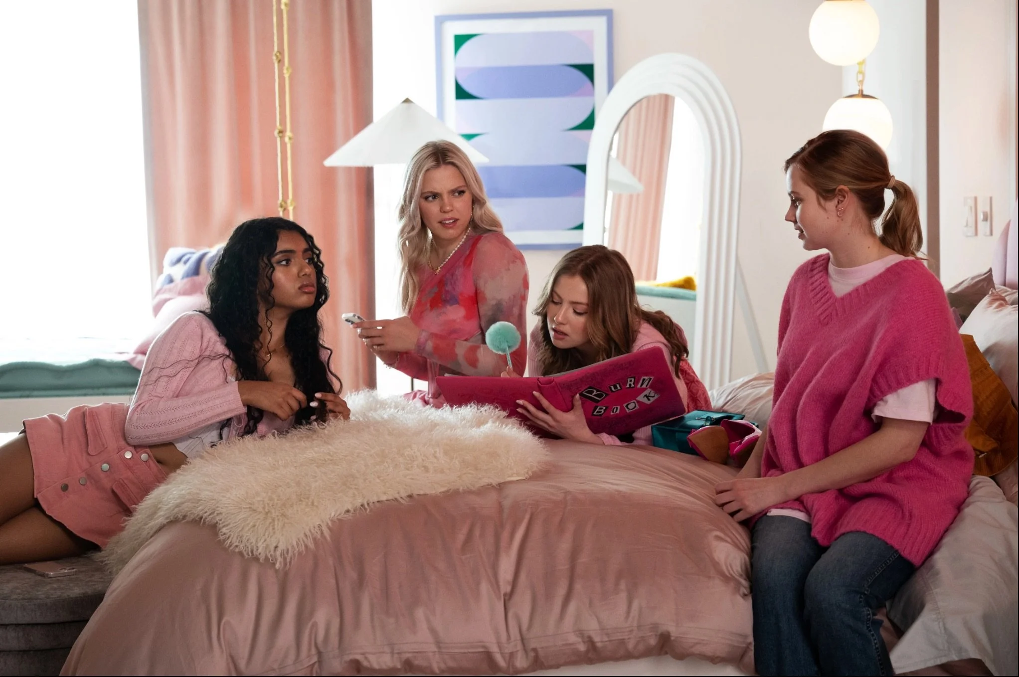
My artwork is in the new movie Mean Girls! Regina George’s room has three of my piece on the walls! OMG!!!

Here are some pics of my pics!

1) Here’s Big Feelings 17 on the wall behind Avantika, Renee Rapp, Bebe Woods and Angourie Rice, no big deal. (Hahahahahahaah) If you need some of that Regina George energy in your life, this limited edition piece is still available on my site!

[Photo by Photo by JoJo Whilden for Paramount Pictures & Entertainment Weekly

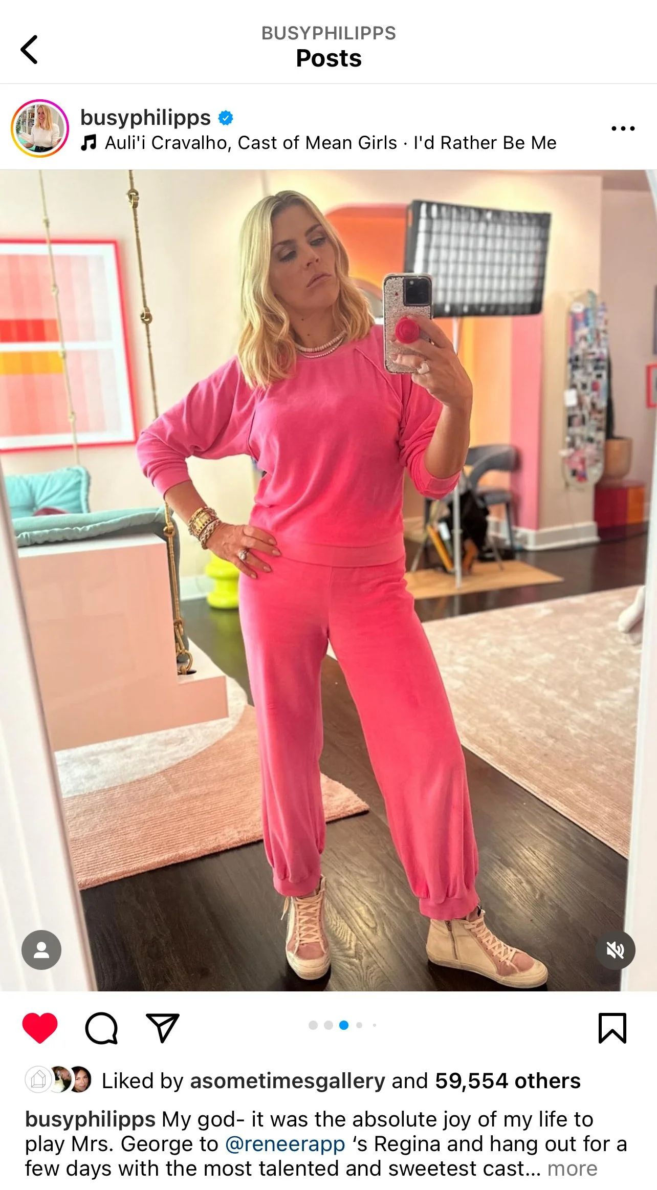
2) Here’s Color Space 27: Keep Love at the Center behind Regina George’s mom, aka “Cool Mom” Busy Philipps!

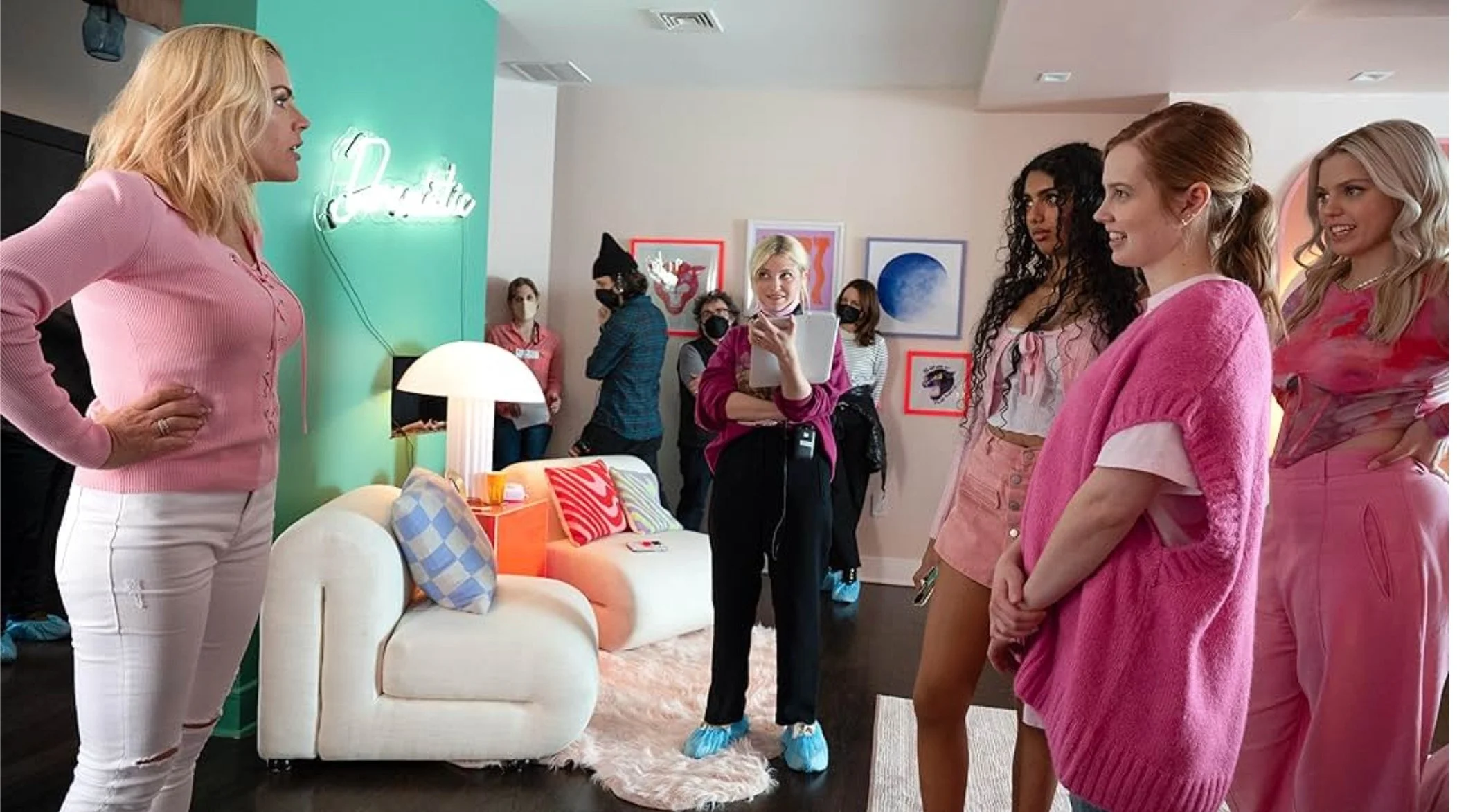
3) Klein Blue Sphere: Soft Geometry is here on the wall during a rehearsal behind Busy, Avantika, Angourie and Renee!

Photo by JoJo Whilden for Paramount Pictures

And who should I spy in the background, with her hair BASICALLY TOUCHING MY ARTWORK, it is the one and only TINA FEYYYYYYYY - and. her husband Jeff Richmond is standing next to her, amaze. Below is a cropped picture for evidence, which basically makes it look like I am a stalker, and I am okay with that. This means I am literally one degree (ish) of separation from Tina Fey, and honestly, what more could I ask for???

Thank you so much to set decorator Charlene Wang de Chen, for including my work in this absolutely fetch set! ;)

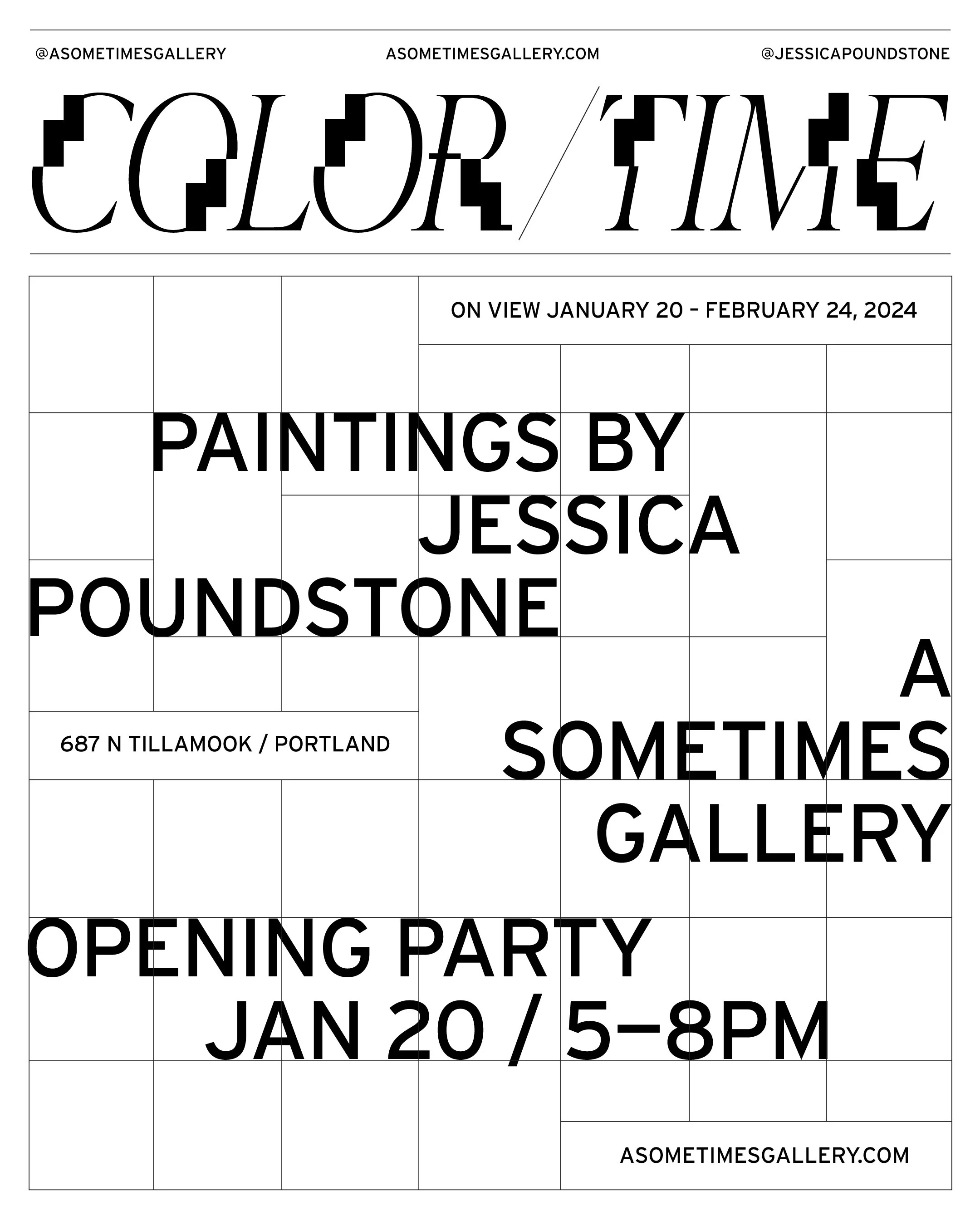
COLOR/TIME: New Paintings By Jessica Poundstone At A Sometimes Gallery

So excited to have my very first solo show of paintings at A Sometimes Gallery!

COLOR/TIME will be on view January 20-February 24, with an opening party (with purple cocktails, pink wine and a DJ!) on January 20 from 5-8pm.

More details are below. If you’d like to get a catalog of the show, just send me your email address and I’ll get it to you!

From the press release:

A Sometimes Gallery is pleased to announce COLOR/TIME, an exhibition of paintings by Portland artist Jessica Poundstone. This will be Poundstone’s first solo show of paintings, and her second show with the gallery.

In this body of work on canvas, formal geometric structures mix with whimsical, intuitive color palettes, creating physical spaces for contemplation. The pieces encourage multiple meditative viewings, and serve as icons — containers, touchstones, totems — for the meaning, memories and meditations we bring to them. 

From her artist statement: “With apologies in advance for a rhyming list of three...I have found that making and looking at these paintings has helped me slow (shifting to a different experience of time), know (accessing my intuition through form and color choices and relationships) and grow (taking in the meditative, positive vibes that happen when a piece clicks together). I hope collectors will share in some (or all!) of these experiences as they bring the pieces into their spaces.”

Coco Gauff, US Open Champion, Sports a Jessica Poundstone Phone Case!

US Open Champion Coco Gauff made a phone call immediately after her win, and her case is one I designed for Casetify x Design Love Fest - “Color Cloud: A New Thing Is On The Way” Whaaaat?!?!?

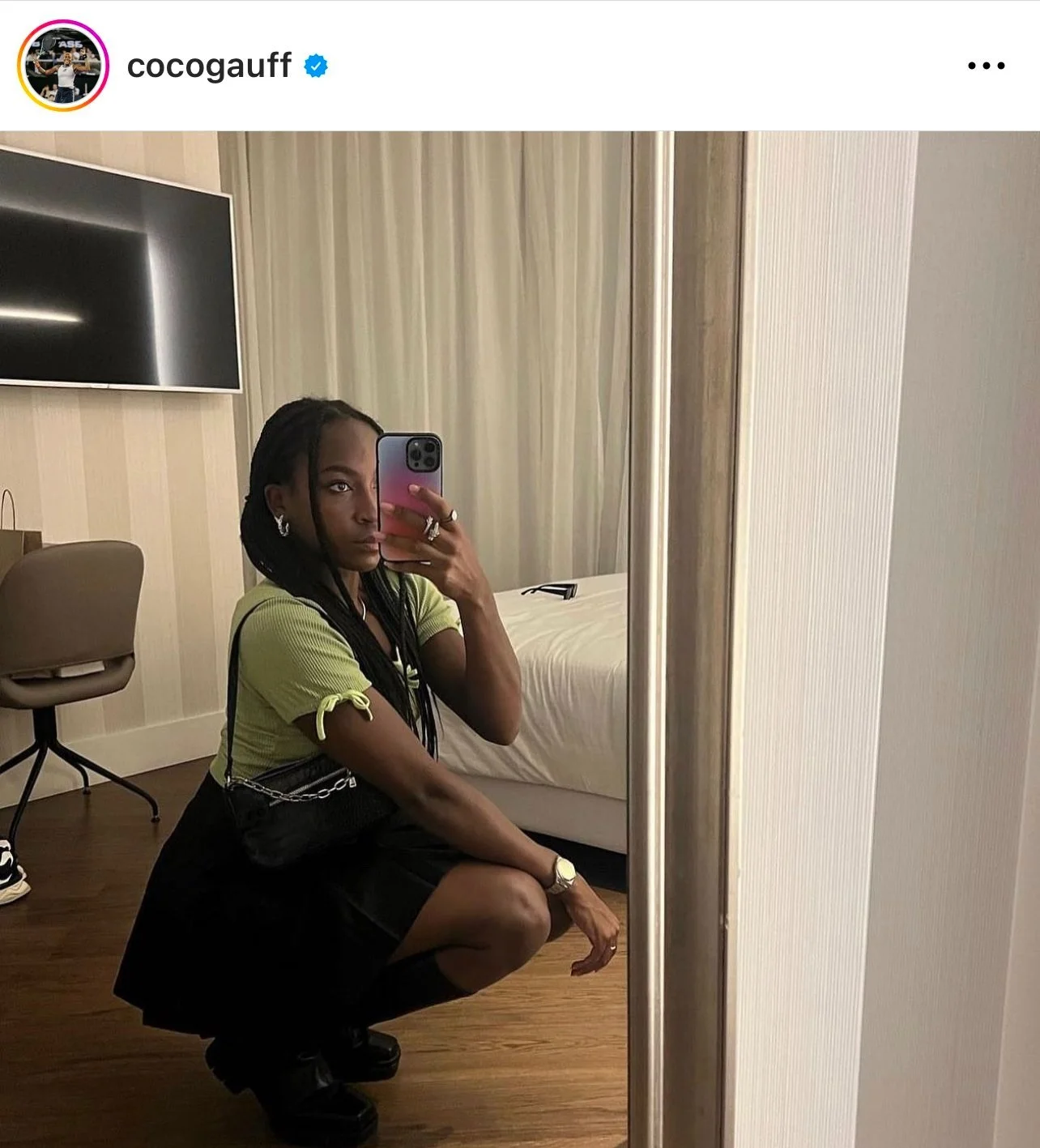
And here she is from an earlier Instagram post on her feed with the case - so freaking cool!

Congratulations, Coco, on your incredible win!!!

If you need a case like Coco’s in your life, you can get it right here - or have a look at the other designs in my collection! There are cases for iPhones, Android phones, laptops, iPads and more. You can use code designlovefest15 for 15% off your order - woo hoo! :)

(Big thanks to my amazing friend Julia Newman-Kuljančić for spotting Coco using the case as she made a call after her win and alerting me - I was watching the match but missed this moment!)

Summer Pop-Up At The Yo Store / Fine Art Fruit

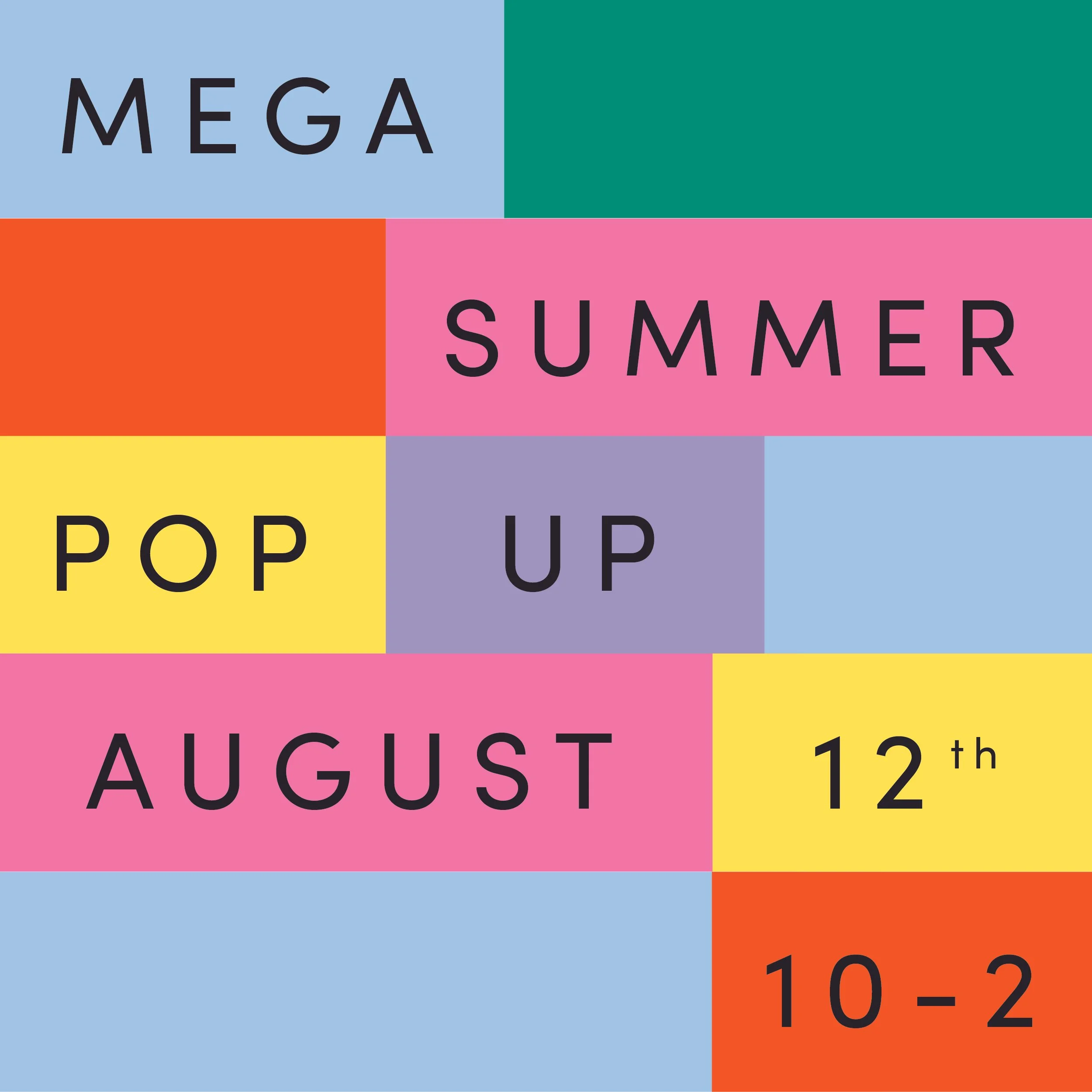
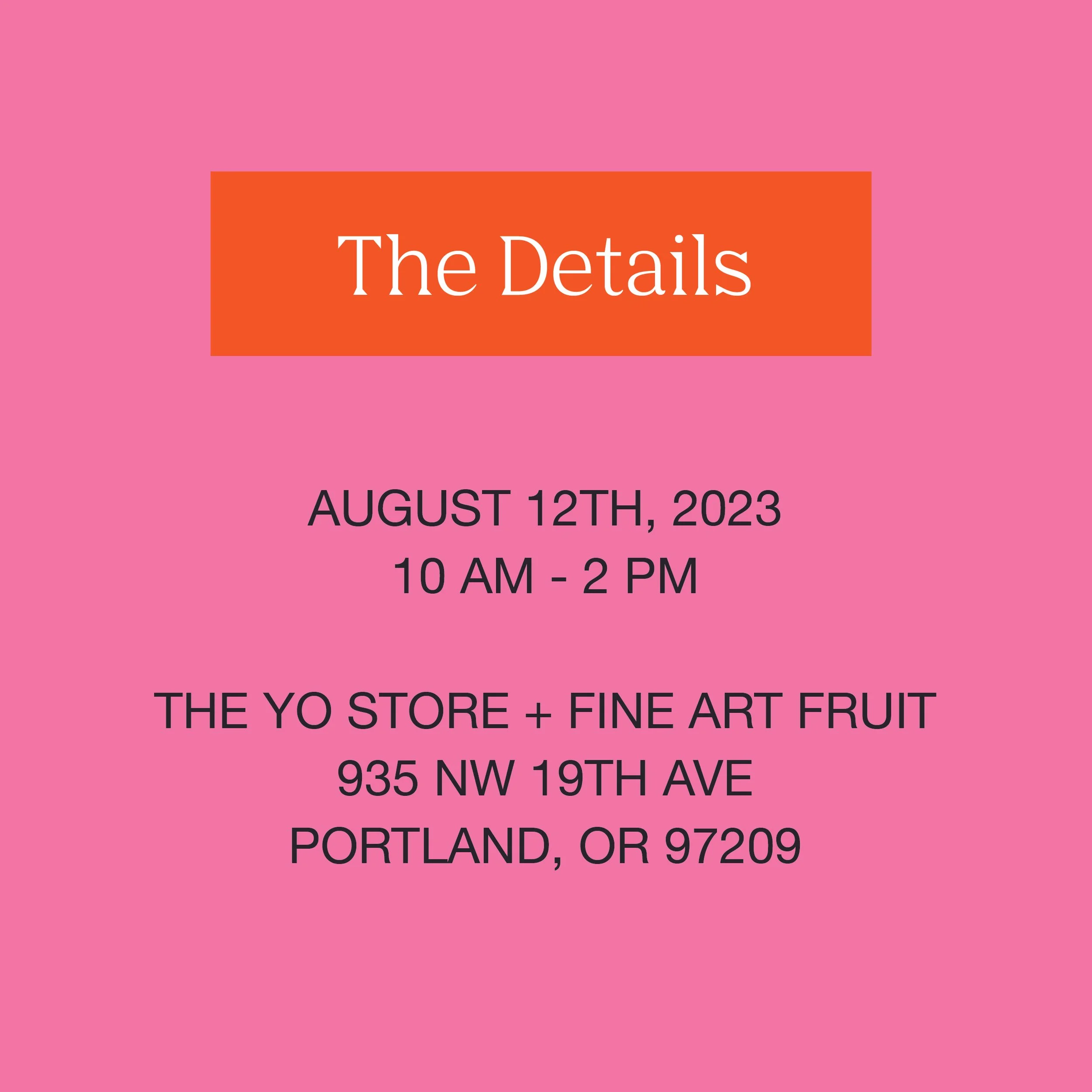
Not-as-hot-as-it-was-gonna-be fun in the summertime Saturday 8/12 from 10am-2pm outside The Yo Store and Fine Art Fruit at 935 NW 19th Ave., Portland Oregon. Come say hey!

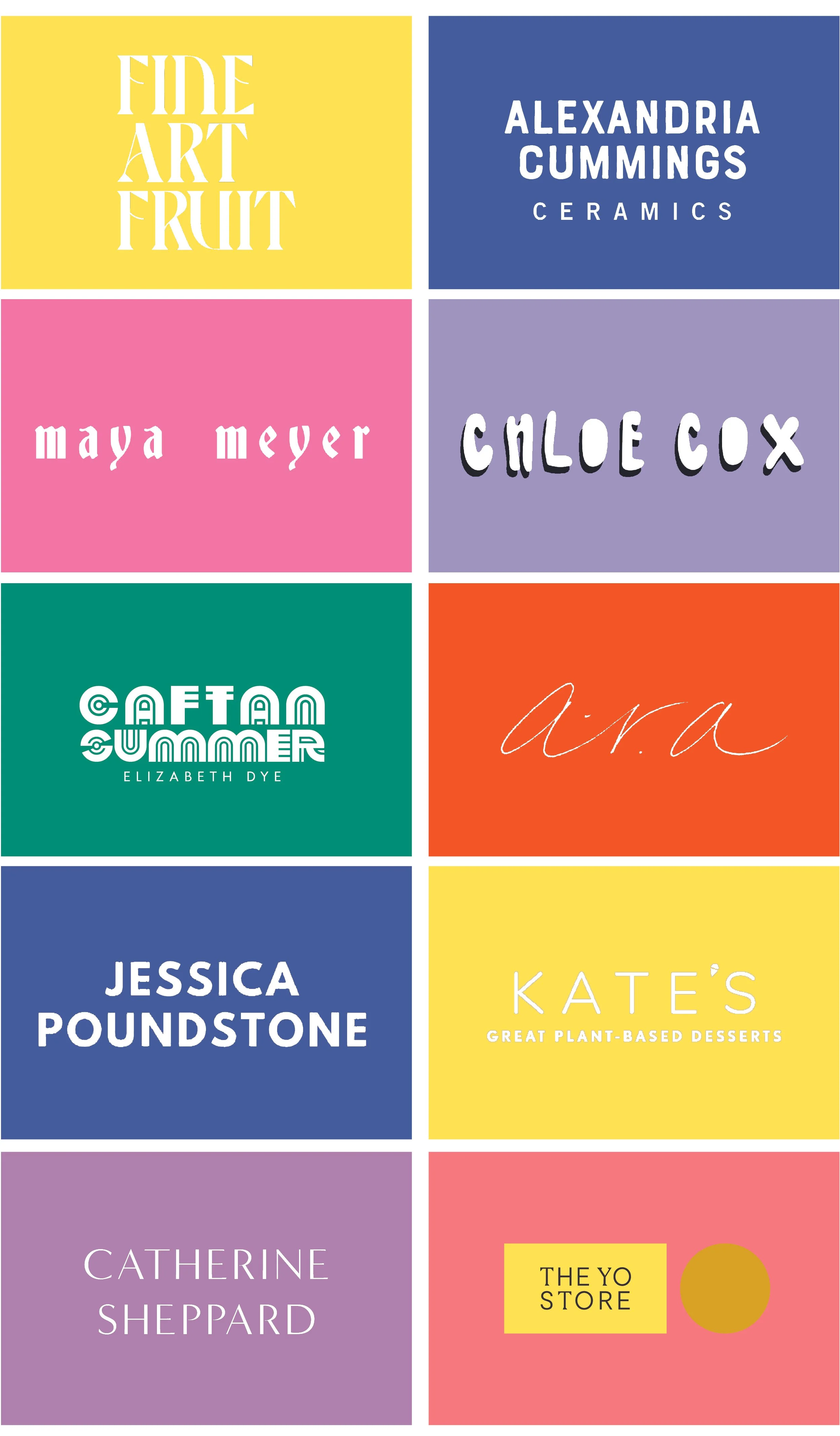
I will have mini-prints! And some fun li’l originals! And some surprises! And extra exclamation points! Seriously tho come through and meet so many wonderful people and see all kinds of wonderful things 💖💖💖 And if you can’t make it, below are links to of all the folks who will be there so you can get on their websites and their wavelength :)

Thanks to The Yo Store godesses for inviting me - hope to see you there!

9 Fun (and Free!) Ways To Refresh Your Space Using The Art Collection You Already Have

Our emotional connection to the artwork we collect is what makes it such an amazing way to infuse more meaning, joy and beauty into our spaces and in our lives. But over time, it’s easy to “stop seeing” things that we look at all the time - and that includes the pieces in our art collections.

Here are nine ideas for refreshing your space using the art in your collection so you can get more enjoyment from the art you’ve already got!


1. Mix It Up: Move Your Art Around!

I move art around my house regularly. I think of the work as always being in a temporary location. This month it’s in the living room. Next month, maybe it migrates to the living room or a bedroom — or even just to a different shelf in a cabinet. Different surroundings quickly create different ways of thinking about the piece and help keep it fresh.


2. Lean instead of hang!

If a piece of art is currently hanging on the wall, consider setting it on the mantel, on a shelf — even the floor. And vice versa - if a piece has been sitting on a mantel for months, find it a spot on a wall.

In the home of one collector, a chair serves as a home for Color Cloud: A New Thing Is On the Way, at least temporarily. I’m pretty sure that Mocu the cat is going to reclaim alllll of that space eventually, hahaha.


3. Make it Part of an Arrangement

Set flowers and a few of your favorite objects around your piece to change the whole vibe! In the picture on the right, the incredible Ashley Hosmer, styled Color Cloud 6: Leave It Open on her sideboard with some puzzles in the same color family. If a piece is on a wall, consider adding floating shelves next to it, or hanging some other decorative wall objects around it.


4. Spend Some One-On-One Time With It

Spend a few moments minutes just being with the piece - think of it as a visual meditation. Even a tiny amount of time can be enough to have a significant shift in your appreciation for and awareness of artwork. If the piece has been with you for a while, take a moment to remember everywhere it’s lived with you, and where it was in each space.


5. Pair It With Another Piece of Art

The way two or more pieces of artwork “speak” to each other can create a totally new dynamic that lights up both pieces in a new way. They don’t have to “match” — there can be a similar theme, color, or anything else that feels like it might create an interesting pairing. Sometimes it helps to have a friend with a flair for design help with this: we get used to seeing things a certain way and can have a hard time seeing new options.


6. Make A Special Home For It

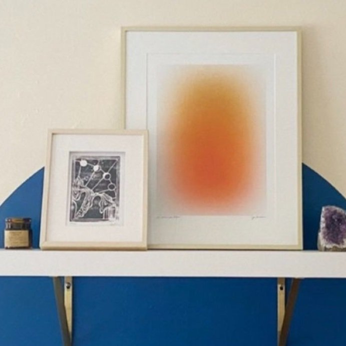
What could you put behind the piece to make it pop? Create a shape behind it on the wall with paint or a removable vinyl decal or wallpaper and see what happens! In this picture, Erica, a designer in Portland, put a blue vinyl circle on the wall and added a shelf with a lovely arrangement of objects. Note that the blue background makes the orange really pop!


7. Post a Picture of it on Social Media

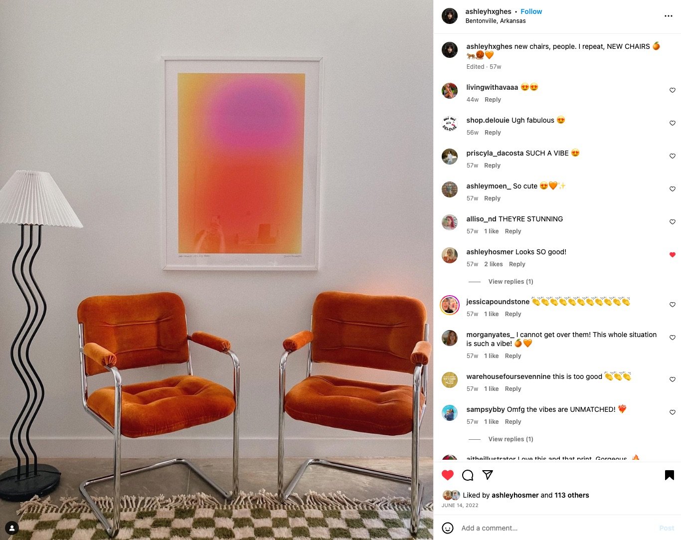
Let folks gush about it — you’ll quickly remember how much you loved it in the first place if everyone else is going ga ga over it :) In this pic on her Instagram, designer Ashley Hughes has paired Color Cloud: Let’s Stay Warm with a gorgeous lamp, pair of chairs and an incredible rug. Clearly her followers are loving the entire situation here, and so do I!


8. Re-Frame It

Maybe you’re just not feeling the minimalist white frame you have for your piece anymore. What if you painted the frame red? Or had it reframed with a massive gilt museum-style frame? In the pic on the left, artist Jacky Boehm framed her pair of Color Clouds in a slim silver frame, which brings out the silvery loveliness in her tie-dyed sheets.


9. Swap Art with a Friend

It could be temporary - or, if a piece is just really no longer speaking to you — consider a trade! The next love of your life might be that thing you saw at your BFFs house that perhaps she’’d enjoy swapping for.

Rearranging your art collection can not only rekindle your love for the pieces you’ve invested in, it is in and of itself an act of creativity! It will not only refresh your space, it will make you feel all warm and fuzzy and lovely. Have fun with it!


About The Author

Jessica Poundstone is an artist and writer living in Portland, Oregon. She believes that art is part of a self-care practice that changes the way we see, think & feel - and ultimately changes us. Her work has been featured by Louis Vuitton, Architectural Digest, Anthropologie and more. She was named a Top 100 artist by Saatchi Art.

Jessica is into, among other things, personal growth, joy, doing her best, detective novels, improv, and standup comedy. Find her artwork at www.jessicapoundstone.com.

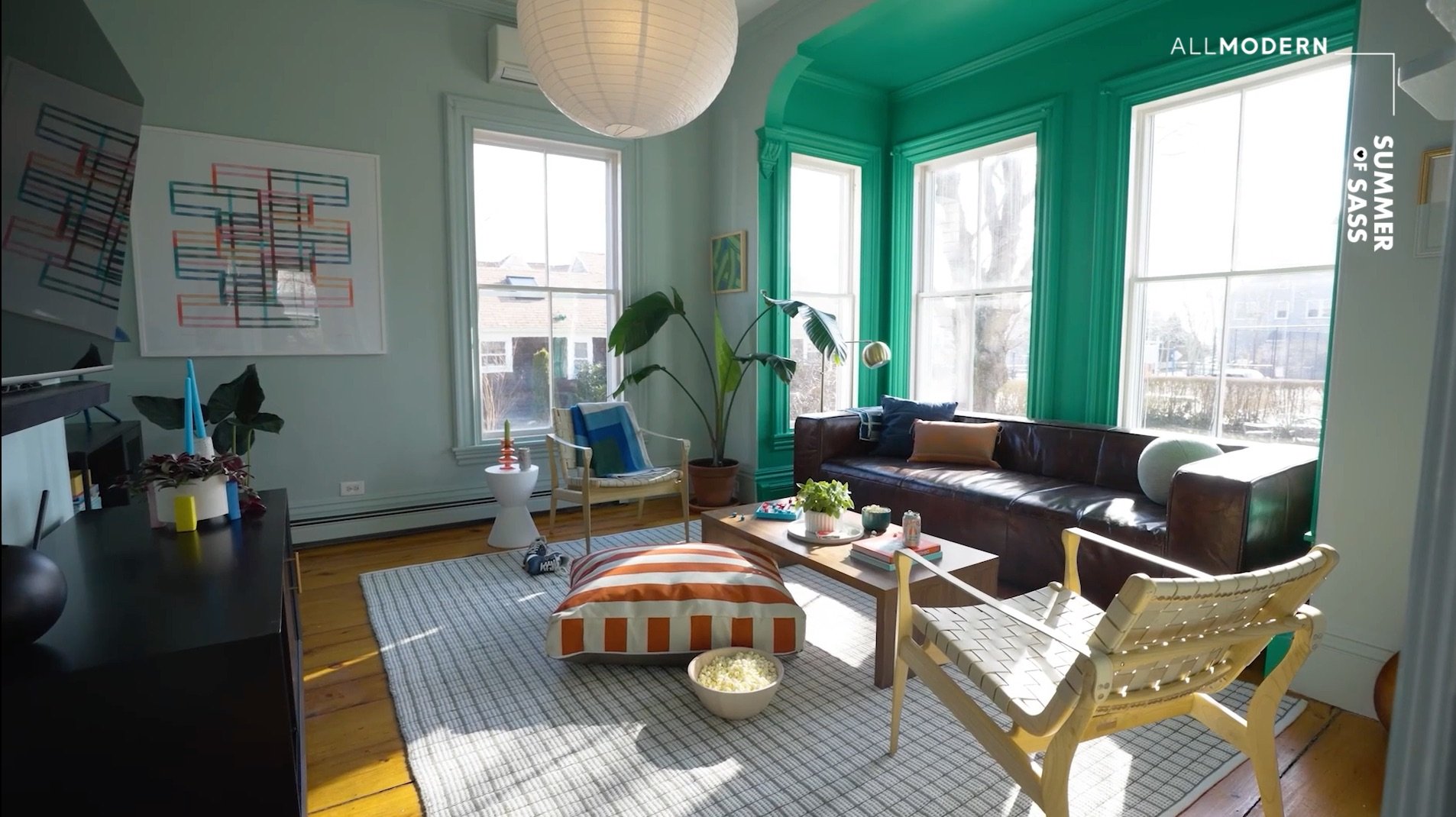
Summer Of Sass House Features Jessica Poundstone Artwork!

Started by comedian Kristen Becker, Summer of Sass is a freaking incredible nonprofit that “transforms lives by relocating LGBTQI 18-20 year olds from oppressive areas in the US to the welcoming community of Provincetown, Massachusetts.”

Last year they were gifted a house, and last month legendary designer Kate Berry & All Modern teamed up to give it the most joyful vibes you can imagine.

I am BEYOND THRILLED to share that four of my pieces (Color Space 66: Tangerine, Color Ideas 23: Thinking About Starting Again, Kinetic Lines 18 and Color Cloud: Let’s Radiate Joy) are now part of this freaking amazing space where so many beautiful, magical and wonderful things are happening.

See before and after pics and in-process vids at All Modern and read the whole article on Domino - words by Gabrielle Korn and photography by Mike Crane. And if you’re able, check out the Summer of Sass website and consider a gift to support their life-changing mission!!! 🌈❤️

jessica Poundstone is Galison’s Artist Of the Month!

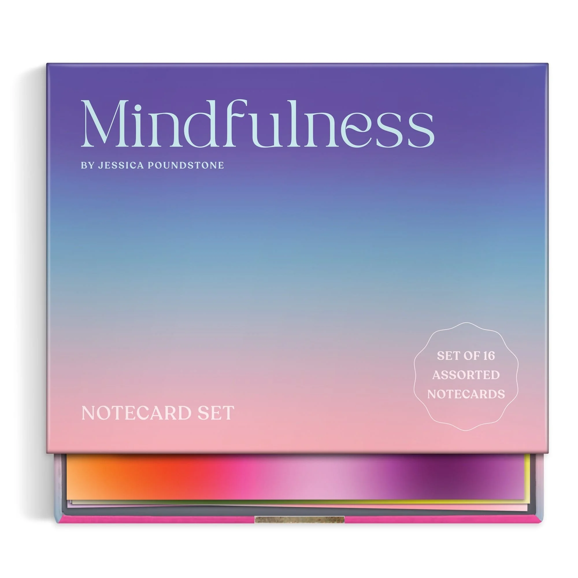
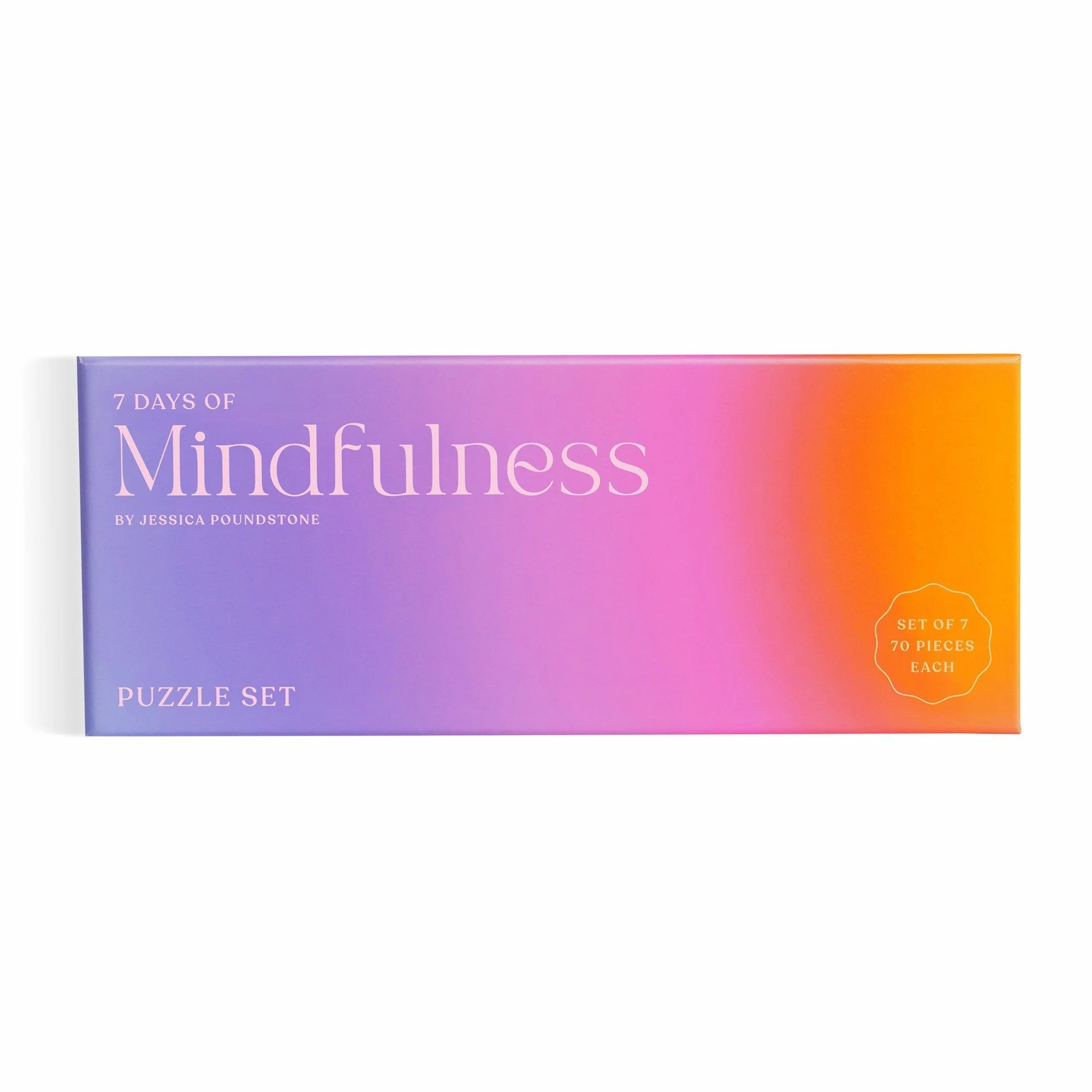
Galison’s Artist of the Month for July c’est moi, Jessica Poundstone! The Galison team has kindly published an interview with me including me behind-the-scenes looks at my cozily-cluttered studio :) See the interview below, and shop the Mindfulness Puzzle Set and Mindfulness Notecards featuring pieces from my Color Cloud Collection. Thank you Galison!


Meet Jessica Poundstone, an artist and creative mind from Portland, Oregon. Her Mindfulness Puzzle Set inspires a relaxing headspace with original art and an opportunity to connect with oneself.

Galison’s Artist Of The Month: Jessica Poundstone


At what point in your life did you know that you wanted to be an artist?

"I’ve always wanted to be involved with art — looking at it, making it, thinking about it: the whole package. But I never knew anyone personally — other than my high school art teacher - shoutout to Leona Nelson! — who called themselves an artist. It wasn’t until pretty recently that I got more comfortable referring to myself that way, and started owning it for myself... It opens doors — in your life and in your mind — to begin thinking of yourself as an artist sooner rather than later!"

What are some things that give you inspiration?

"For inspiration for new work: buildings, sidewalks, books on art, street fashion, the way the light hits a wall, unexpected color palates I happen to notice (the other day it was a semi-truck’s cab/container color combo that got me excited!), films, certain songs I’ll listen to over and over: I get inspiration from so many places it can be overwhelming!"

What are three things you need in your workspace?

"Other than the basics — my computers, art supplies and good lighting — my workspace has got to have coffee (strong, dark with cream no sugar), water (preferably LaCroix Pamplemousse or Beach Plum) and my playlist which, depending on what I’m trying to get done, is a mix of faves like Talking Heads, Spoon, REM and PJ Harvey, or white noise (rain sounds, of course - I’m originally from and still live in Portland, Oregon!)."

Why is art important in everyday life? 

"My favorite pieces of art give me a little jolt of beauty that says: 'Hey don’t forget: there’s so much mystery, fun, adventure and joy available to you!' That reminder to zoom out and see a bigger picture (haha, no pun intended) is important to me — especially when the routines of everyday life feel stifling. Art is a window we can always crawl through."

Mindfulness Notecards & Mindfulness Puzzle Set featuring my Color Cloud Collection are available at Galison or most places books and gifts are sold!

Louis Vuitton in Kobe Japan Features Jessica Poundstone's "Color Cloud: Tap Into It"

Kobe, Japan’s Louis Vuitton is sporting a custom version of “Color Cloud: Tap Into It”! If you’re ever in the area, go say hi for me :)

We almost always have more resources, strength and energy than we think. It’s remembering to tap into those that can be hard, because it often requires us to admit that we need help. Let this remind us to do that.

Still some available in the original version in its limited edition run: snag one if you’re feeling it!

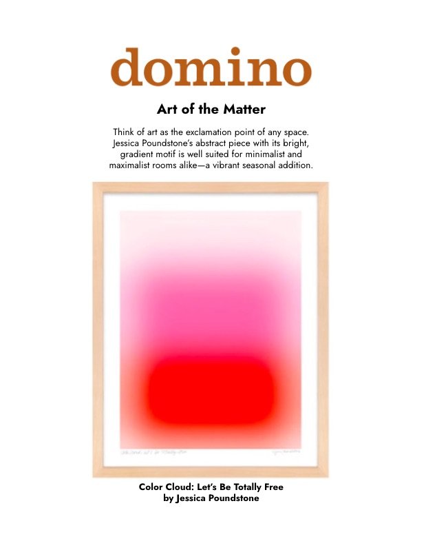
Domino Magazine Features Jessica Poundstone Art "Color Cloud: Let's Be Totally Free"

Thanks Domino Magazine & All Modern for the kind words about “Color Cloud: Let’s Be Totally Free.”

This piece is about ditching any preconceived notions about what we are “allowed” to do or be, and move towards doing and being exactly what we want. Even if it seems risky. Maybe especially if it seems risky :)

Like all my Color Cloud pieces, it’s made with love by me and my fingers on my iPad, then printed with pigment inks on thick, 100% cotton fine art paper when you order it so there’s no waste! Snag one today if you need these vibes in your life!

Apartment Therapy Features Art By Jessica Poundstone

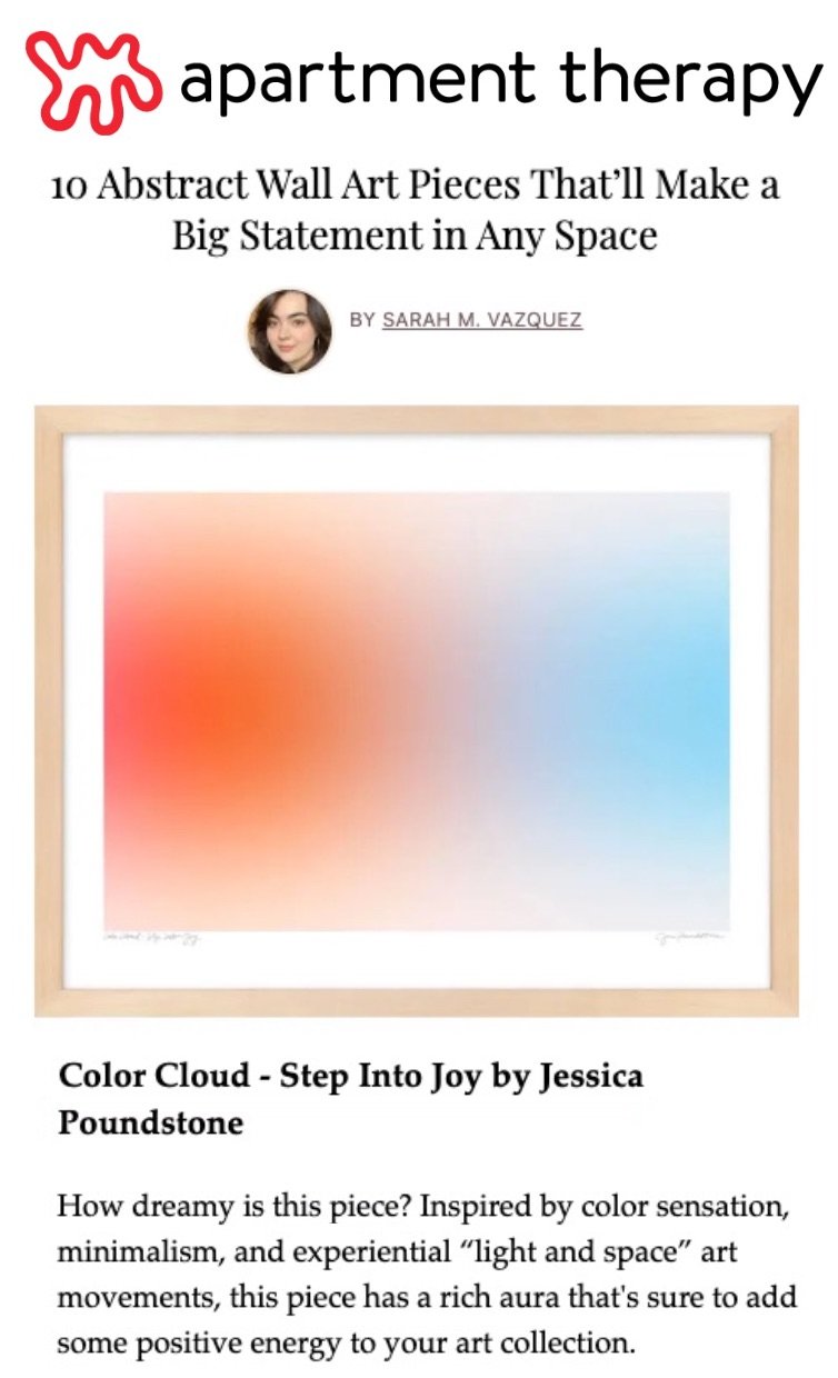
Thank you Apartment Therapy and writer Sarah M. Vazquez for this article, “Abstract Wall Art Pieces That’ll Make a Big Statement in Any Space” featuring my artwork “Color Cloud: Step Into Joy”!

Text: “How dreamy is this piece? Inspired by color sensation, minimalism, and experiential ‘light and space’ art movements, this piece has a rich aura that’s sure to add some positive energy to your art collection.”

Thanks again Apartment Therapy for the feature! Read the full article here.

Jessica Poundstone Paintings at Fruitsuper in Seattle!

Fruitsuper Design Shop & Gallery in Seattle is an amazing place run by amazing folks, and - lucky me! - I was invited to be part of a group show there called Findings that opens on Thursday, March 2, and will be up through April 6!

Below are the pieces of mine that will be there, from my “Everything Leads to Something” series.

Findings is “an exhibition of small works that “celebrate the beginnings of living with and surrounding oneself with art.” Love it. All of the works in the show will be available for $250 or under. A list of participating artists and links to their work is below - check them out in person or online if you can’t make it to Seattle!

Thanks again Sallyann for the invite - can’t wait to see all the work!

Artists With Work in Findings:

Nishat Akhtar
Nikita Ares
Ceremony
Emily Counts
Sam Dodie
Michael Doyle
Jessica Flores
fruitsuper
Rachel Illingworth
Pat Kim
Nia Musiba
Hernan Paganini
Jessica Poundstone
Sue Rose
Toni Santos
Stevie Shao
Gabriel Stromberg
Brandon Vosika
Amanda Woodcock

Interior Designer Mimi Shin Features Jessica Poundstone's "Glow 5: Rose Gold Strength" in LA Home Design

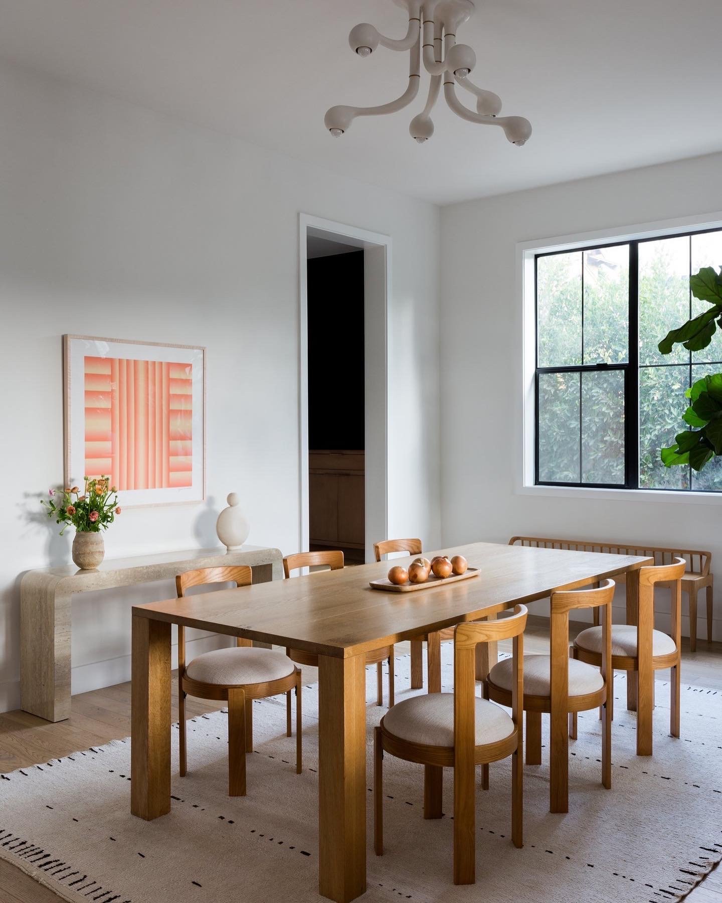
My artwork “Glow 5: Rose Gold Strength” now hangs in this extraordinarily sophisticated LA dining room designed by Mimi Shin!

Design, Mimi Shin. Styling, Kate Flynn. Photos, Amy Bartlam

Mimi’s whole house design for is SO good the whole project was featured in both Rue Magazine and in Architectural Digest.
Architectural Digest article featuring Mimi Shin interior design project in Los Angeles

Architectural Digest article featuring Mimi Shin’s LA project, which also features an unbelievably inventive waterbed situation! Design, Mimi Shin. Styling, Kate Flynn. Photos, Amy Bartlam

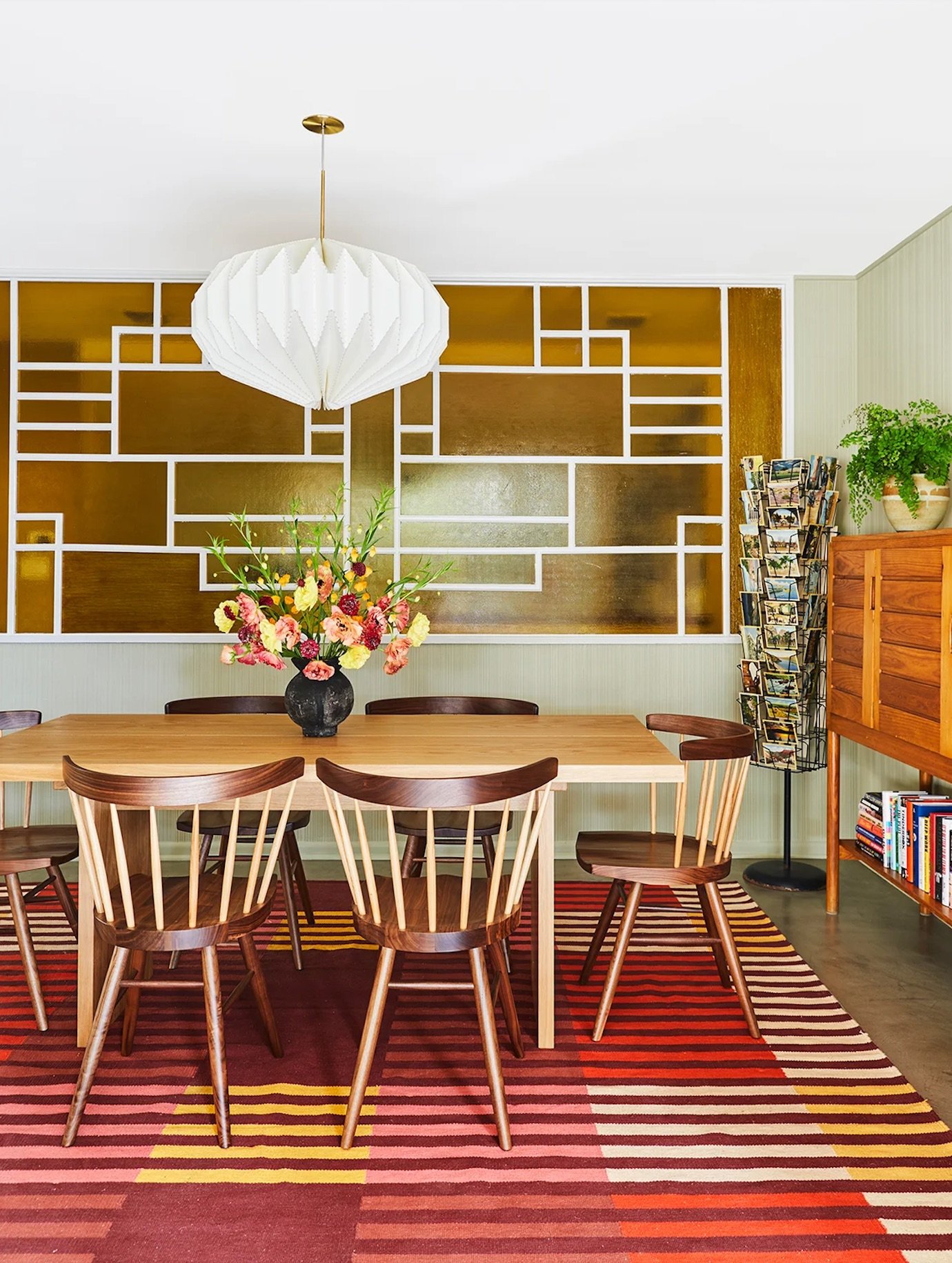
Rue Magazine’s feature of Mimi Shin’s project, including this dining room featuring my artwork “Glow 5: Rose Gold Strength.” Design, Mimi Shin. Styling, Kate Flynn. Photos, Amy Bartlam

By the way, here’s an excerpt from Mimi Shin’s bio (omgeeeee):

“After discovering her love of modern art at Smith College, she began her career in fashion and became an editor at Vogue within just a few years. She traveled extensively to Milan and Paris representing Vogue and then Harper’s Bazaar for a decade. Craving a new discipline to apply her experience and recognizing the cultural capital and creative freedom that Los Angeles had begun to offer, she headed west for her masters degree in architecture at UCLA. Upon graduation, she launched a furniture line critically reviewed by the New York Times, Sunset and ca magazines and subsequent residential and commercial projects have been featured in both Luxe and Los Angeles Magazine.”

What an amazing career / artist / person!!!

Styling for this shoot by Kate Flynn, and photography by Amy Bartlam.

Thank you for bringing my work into this beautiful space, Mimi!